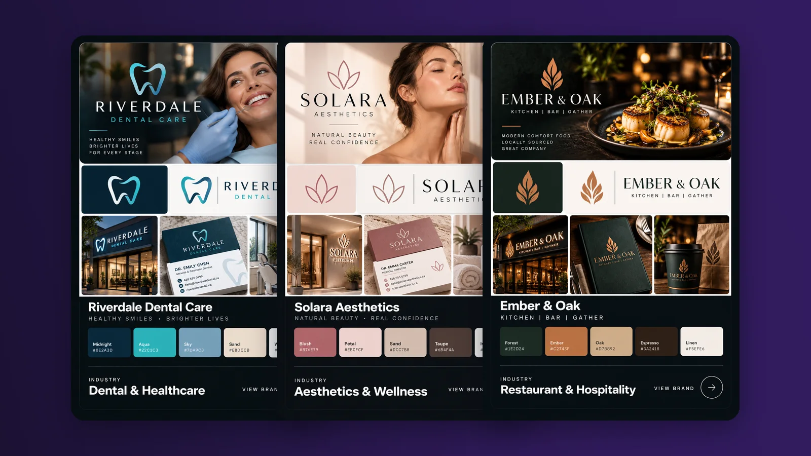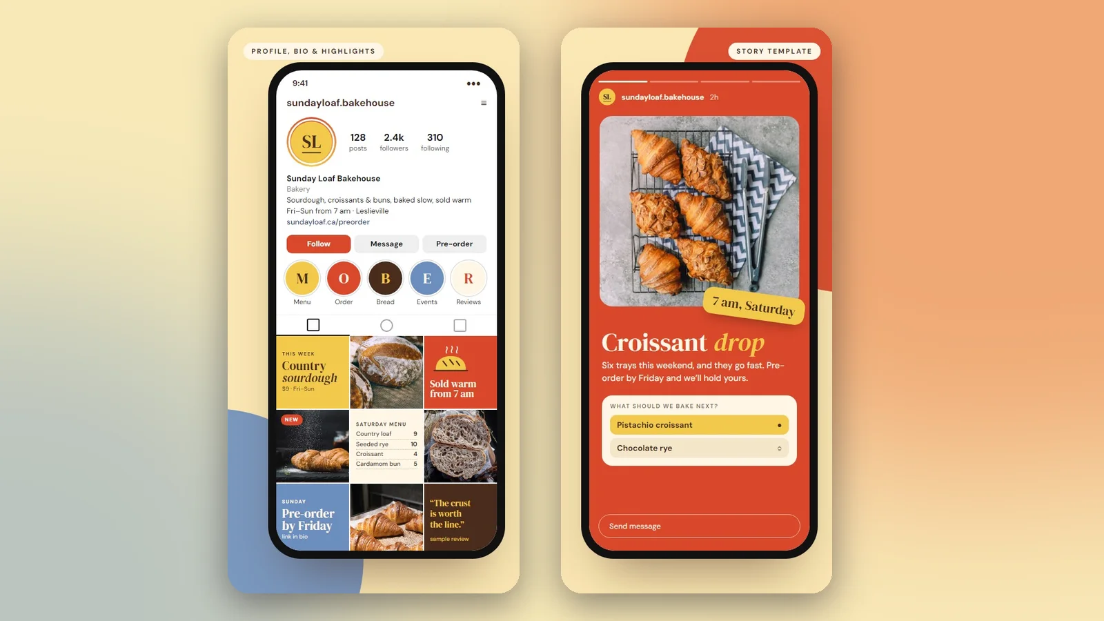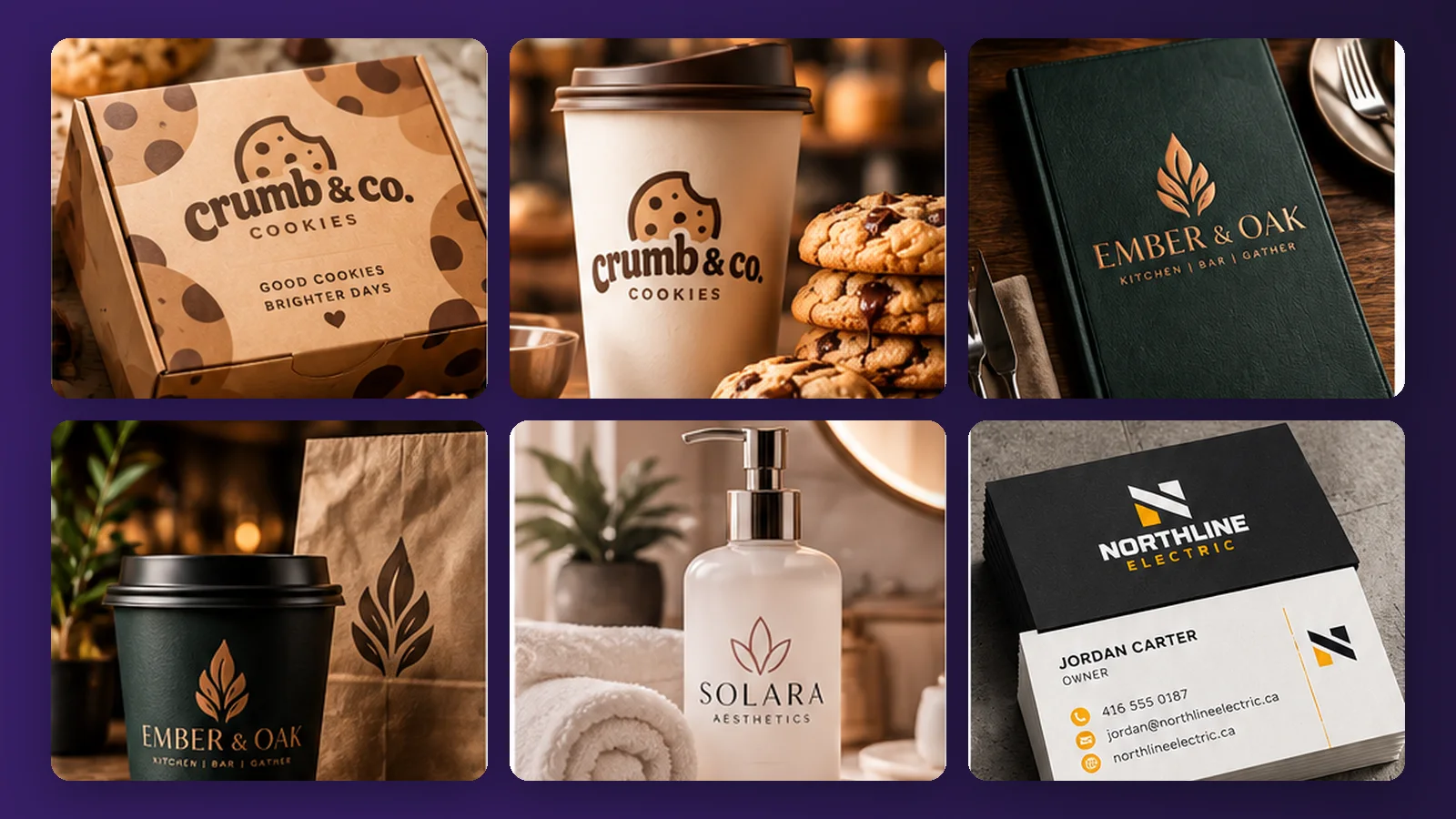
Packaging is often the first thing a customer actually holds. It is also one of the easiest places to lose money: a run of labels printed with the wrong size, missing text or a colour that looks nothing like the screen. Here is a checklist to work through before anything goes to the printer.
1. Start with the text that has to be there
Before you think about style, list what must appear: the product name, your business name and contact details, and, for food, the ingredients, allergens and quantity. Food labels in Canada have legal requirements, including bilingual English and French text on many prepackaged products. Check the current rules with the Canadian Food Inspection Agency, or your local public health unit, before you print, and leave room for that text in the design. It is much easier to design around required text than to squeeze it in afterwards.
2. Get the files print-ready
A design that looks fine on a screen can still be wrong for print. Ask for, or make, files that have:
- Bleed. Artwork that runs slightly past the cut line, so a small trimming error does not leave a white edge.
- A safe area. Important text kept away from the edge and from folds.
- Vector artwork. Logos that stay sharp at any size, not enlarged screenshots.
- Print colours. Colours checked for print, since some bright screen colours do not print the way they look.
3. Design one system, not separate pieces
Boxes, bands, seals, product and flavour labels, stickers, bag toppers, thank-you cards and tissue paper are all the same brand meeting the customer at different moments. If they share a palette, type and a few repeating shapes, a shelf or a table of them reads as one business. A simple trick for product ranges is to give each flavour or variety its own accent colour within the same layout.

4. Think about the material
Kraft paper, white stock, glossy and matte finishes all change how a colour looks. Where you can, ask your printer for a proof on the real material, and check it in the light where customers will see it. A dark colour on kraft paper, for example, looks different from the same colour on white.
5. Plan for the small stuff
Ingredient and allergen labels, stickers, bag labels and thank-you cards are the pieces people skip and then need in a hurry. Design them at the same time as the box, so they match and so you are not reordering under pressure.
Most packaging mistakes are decided before printing. The time to catch them is the checklist, not the invoice.
A short checklist
- Required text listed, with space reserved for it
- Artwork supplied with bleed and a safe area
- Logos as vector files
- Colours checked for print
- A printed proof on the real material
- Labels, stickers and cards designed alongside the box
Where we come in
Packaging is part of our brand identity work: boxes and lids, bands and seals, product and flavour labels, ingredient and allergen labels, stickers and print-ready files, all designed to match the rest of your brand. Details are on the brand identity page, and it is quoted per project.